Inspiring fans for more than 30 years, Food Network is a top cable network distributed to millions of U.S. households, and our website, foodnetwork.com, attracts millions of users weekly. All Food Network recipes are created and tested by our culinary experts in the Food Network Kitchen, located in our New York offices on Park Avenue. Food Network also includes the monthly Food Network Magazine plus exclusive collections of kitchen-oriented products through the Food Network consumer product line at Kohls, and the Food Network Kitchen app. Food Network is owned by Warner Bros. Discovery, a leading global media and entertainment company.
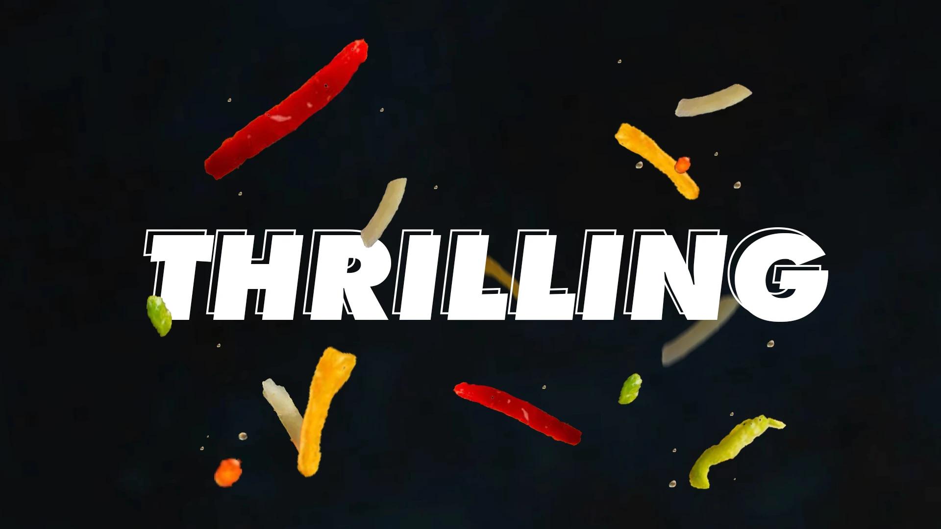
The goal of this project was to create a 10-second ident for the Food Network Channel. Drawing inspiration from the adrenaline-fueled competitive cook-off shows, the ident's narrative channels the vibrant energy similar to sports events. It's dynamic, fast-paced, and carries an assertive energy, ultilizing kinetic typography to embody the spirit of competition seen in these shows.
Ident
Written Treatment
The Food Network strives to be viewers' best friend in food and is committed to leading by teaching, inspiring and empowering through its talent and expertise. The Ident piece I will be making is specifically targeting the afternoon time slot, starting at 1pm. During this time slot, many competitive cooking shows are on such as: Chopped, Hell’s kitchen, Guy’s Grocery Games, and more. Which is targeted towards a more youthful demographic but also continues into the night where families get together to watch some TV.
This Ident will be fast-paced, mimicking the nature of the competitive cooking games. The story I want to portray in this ident is being tossed in a middle of a battle, at the climax of the story. There will be a lot of skillet movements, fire, food being chopped, as well as food being thrown (in the air). This will catch the viewers attention immediately. Towards the end of the indent, I want to slow down and settle with a finished dish being presented to the viewer, this is where the Food Network logo will appear.
Mindmap + brain Dump


Moodboard

Styleframes (Style was not used)


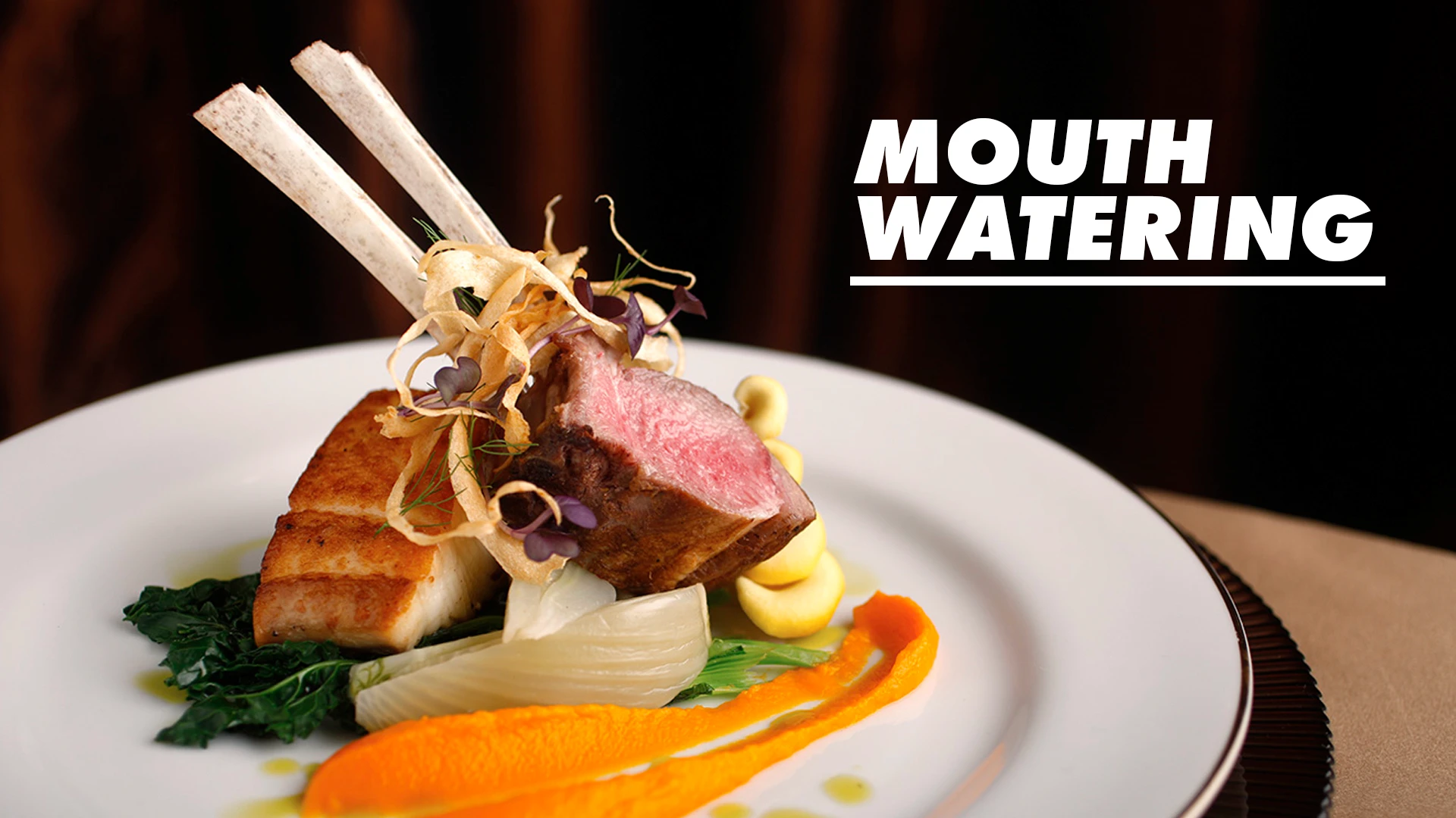

Originally, the style frames were envisioned with a darker, near luxurious. However, with the restrictions of available stock footage, the final product leaned towards a lighter, brighter identity, pushing the project to a more family-oriented vibe.